
Book cover reveal
4 March, 2026
There’s always a lot of hype around a cover reveal, and I wanted to make sure you saw it here first.
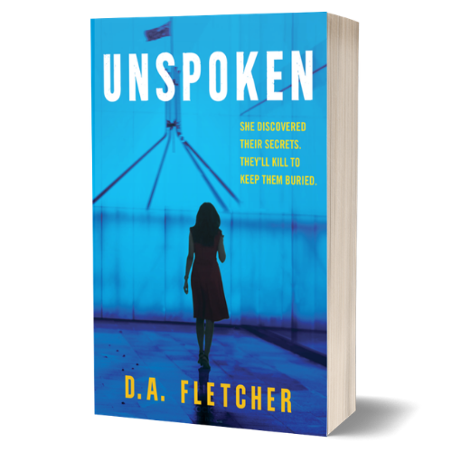
I absolutely love it. The simplicity speaks volumes.
At a glance, the background gives you the context. Then you see the lone figure - one person standing in the shadow of power.
I must admit, going through the book cover process has been a real learning curve.
It turns out book covers aren’t just about what looks nice! There’s a lot the publisher and designers are thinking about.
Here are just a couple of things I learnt along the way:
My original thought was that the cover should look completely different from everything else on the shelf. In fact, the opposite is true. Readers instinctively look for familiar clues. Colours, fonts and overall style quietly signal whether you’re about to open a thriller, a romance or something more literary.
Before you’ve even read the blurb, your brain has decided what kind of ride the author is offering and whether it’s for you.
Research shows 79% of readers make a snap judgement based on the cover alone.
And modern book covers have to work in multiple settings.
No longer can it be designed for a bookstore shelf alone. It has to stand out from metres away and also survive being reduced to a tiny thumbnail on online bookstores.
That’s why designers pay so much attention to bold typography, strong contrast and simple imagery. It isn’t about decoration. It’s about visibility.
If the title disappears when it shrinks to thumbnail size, the cover fails - no matter how beautiful it might look up close.
So the cover for Unspoken isn’t accidental. A lot of thought sits behind it, all aimed at helping the right readers find it.